The Aggregates & Recycling Information Network, known as Agg-Net, is the leading online resource for aggregate and recycling news, jobs and directories in the UK. We’d worked with QMJ Publishing before on their Hillhead 2012 site, so when when they decided it was time to overhaul their largest Drupal site, we were their first port of call.
Project Highlights
- Content migration from an old Drupal 5 site
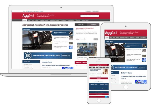
We exported over 25,000 pages and import them into the new Drupal 7 site. - Mobile friendly Drupal 7 website design
Responsive designs were created for mobile first, through to desktop sizes. - Intelligent restructuring of mass content
The content structure and sitemap was reviewed, then redefined with a cleaner architecture.
The Brief
The existing website was a large site which ran on a relatively unstable version of Drupal 5. The site contained well over 22,000 pages and one of the requirements of the redevelopment was that all the content would need to be moved over to the new Drupal 7 site.
The existing site had been developed in 2008, and was designed to target small desktop screens with a browser resolution of 800x600. This now didn’t work well on mobile or on the larger displays that many users now have. The website’s administrators were often left feeling frustrated by the terrible user experience when editing content.
The main objectives of the project were:
- Better experience for all users without making drastic changes to the brand
- Provide a more solid foundation that could be extended further in future
- Make editing and adding content, and reporting much easier and quicker for admins
- Restructure some large areas of content
- Introduce better tagging, searching and filtering systems across the site
- Make the site more accessible and optimised for search engines
- Provide ways to share pages, jobs and news through social media.
Through discovery workshops, we were able to help focus the requirements on improving the experience for users and understand a more better way to restructure the content through persona creation, user stories and user journey analysis.
It immediately became apparent that there was an essential requirement to specifically cater for mobile users, whilst providing an improved experience for large-screen desktop users, with no content loss. The challenge was set!
Design
We produced black and white interactive wireframes using prototyping software to restructure the information architecture based on the discovery workshops and refined project goals.
More important content was given clearer priority and the overall layout was designed to be more modular to facilitate resizing down to tablet-sized screens. iPads were identified as a target device based on supporting evidence found in Agg-net’s Google analytics.
We also produced extensive mobile wireframe layouts, and radically redesigned the content structure in order to facilitate a design that provides end users with a more app-like interface. This was a challenge, considering the sheer amount of text and image content that needed to be fully accessible to all users.
We redesigned the entire site, bringing it up to date while remaining true to the existing brand visuals. We had the additional considerations of designing for a responsive site and making sure that we catered for retina displays by using CSS where possible as well as using web fonts for all text.
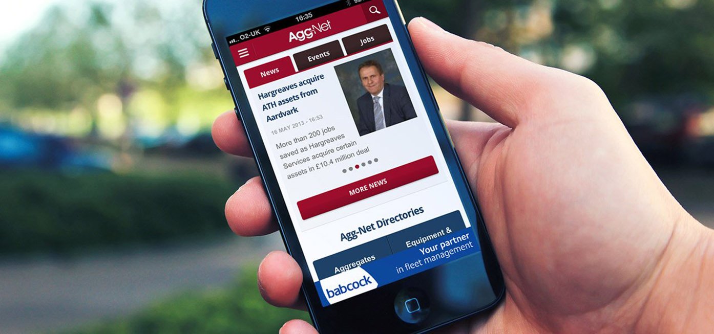
We created an entirely new app-like design for the mobile version of the site. This design was created with a primary objective to condense the content, and provide a clean, touch-friendly user interface. We did this by intelligently collating primary and secondary navigation items into expandable menus and using mobile iconography conventions to reduce on-screen text, and condense menus, maximising available screen space for the content. We also designed interactive image slideshows that can be controlled with touch gestures and defined an entirely different set of advertising zones than the desktop site to better suit mobile screens.
Build
With the signed-off user stories, designs and technical specification, we were well-prepared to create a fresh install of Drupal 7 with many new modules that would replace clunky custom modules or outdated Drupal 5 modules. This provides a solid base for future extensibility and more usable upgrade paths for when the time comes to migrate to Drupal 8.
Due to the instability of the existing site and the quantity of content, we decided to write custom PHP scripts which connected to the database. We produced several paper-based content remapping diagrams and our office resembled certain scenes from A Beautiful Mind for a few weeks!
In the end we chose a manual process for exporting, restructuring and importing content into the new Drupal 7 site. This enabled us to select specific content that we wanted to pull out of the old site and gave us more flexibility in importing the data into the new architecture, giving us the benefit of refining what we exported from the site.
We created a Drupal-based mobile website under a separate domain name for browsers smaller than tablet size, rather than having just one fully responsive website. This decision was made because Agg-Net.com because of the volume of content, and rather than hiding a lot of this content on a mobile device (and lessening the experience for the user), we wanted mobile users to have access to the same rich content that desktop users do but have a much more focussed experience (mobile bandwidth is pretty limited - and expensive).
Optimise
Early on in the project we identified an issue with the Flash-based video advertising that was being served to users: in Flash it wouldn’t work on iPads or other tablets. We redeveloped iPad-friendly HTML5 versions of their interactive adverts so that video and other interactive advertising content could be consistently served to all tablets.
Lastly we looked at speed optimisation for the new websites. We’d developed some complex faceted search functionality and other new features and improvements, resulting in far more database queries than on the Drupal 5 version of the site. Another consideration was that the site needed to load fast and not use too much bandwidth for mobile users. To ensure excellent loading speeds, we set up an nginx as a reverse proxy cache with several bespoke optimisations to increase performance of the site for anonymous users, optimised page caching manually across the site, fine-tuned page load speeds using a suite of online and offline tools and designed CSS sprites for bitmap images.
Evolve
We launched the new responsive site in July 2012, just before the bi-annual Hillhead conference. We have now adopted an agile approach to working on the site iterating and improving features, developing bespoke Drupal modules, and providing various additional designs and interactive media.
Social media functionality on the new website has resulted in growing their audience and engagement with users, especially on mobile devices.
Load speeds are now 4 times faster than they were on the old site and administrators no longer have a headache every time they want to add content. It’s fast, easy and if they need any further functionality adding as time goes on, it’ll be a cinch with their fantastic new Drupal build.